Tate

Info
X

Tate

'Andy Warhol'

Exhibition Catalogue


For this catalogue we proposed not to include the title on the front cover as the imagery is recognisable enough to stand alone and make a powerful statement. We referenced early Warhol Interview magazine layouts to create an editorial style two-column grid with bold headlines. The edges of the hardback and paperback were sprayed with a block colour in order for the book to resemble an object, reminiscent of Warhol’s packaging works.

Scroll down for more projects

Tate

Info
X

Tate

'Life Between Islands: Caribbean-British Art 1950S – Now'

Exhibition catalogue


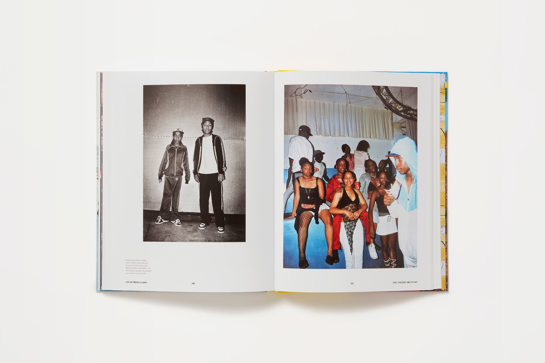
The Bon Ton were commissioned to design the catalogue for the Life Between Islands at Tate Britain; a landmark group exhibition celebrating 70 years of Caribbean-British art. Our choice for the typography was inspired by the lettering used on the Empire Windrush boat. We were influenced by the theme of movement, allowing the blocks of text to cross the entire page from one point to the other.