X
Matilda Goad & Co
Brand identity
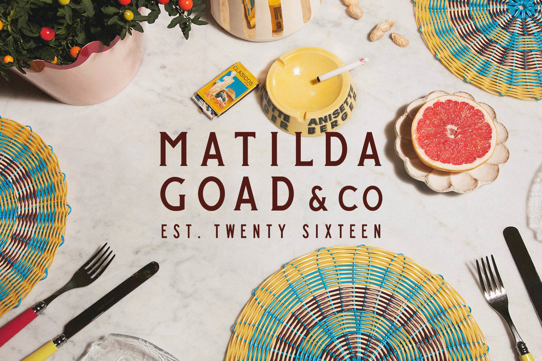
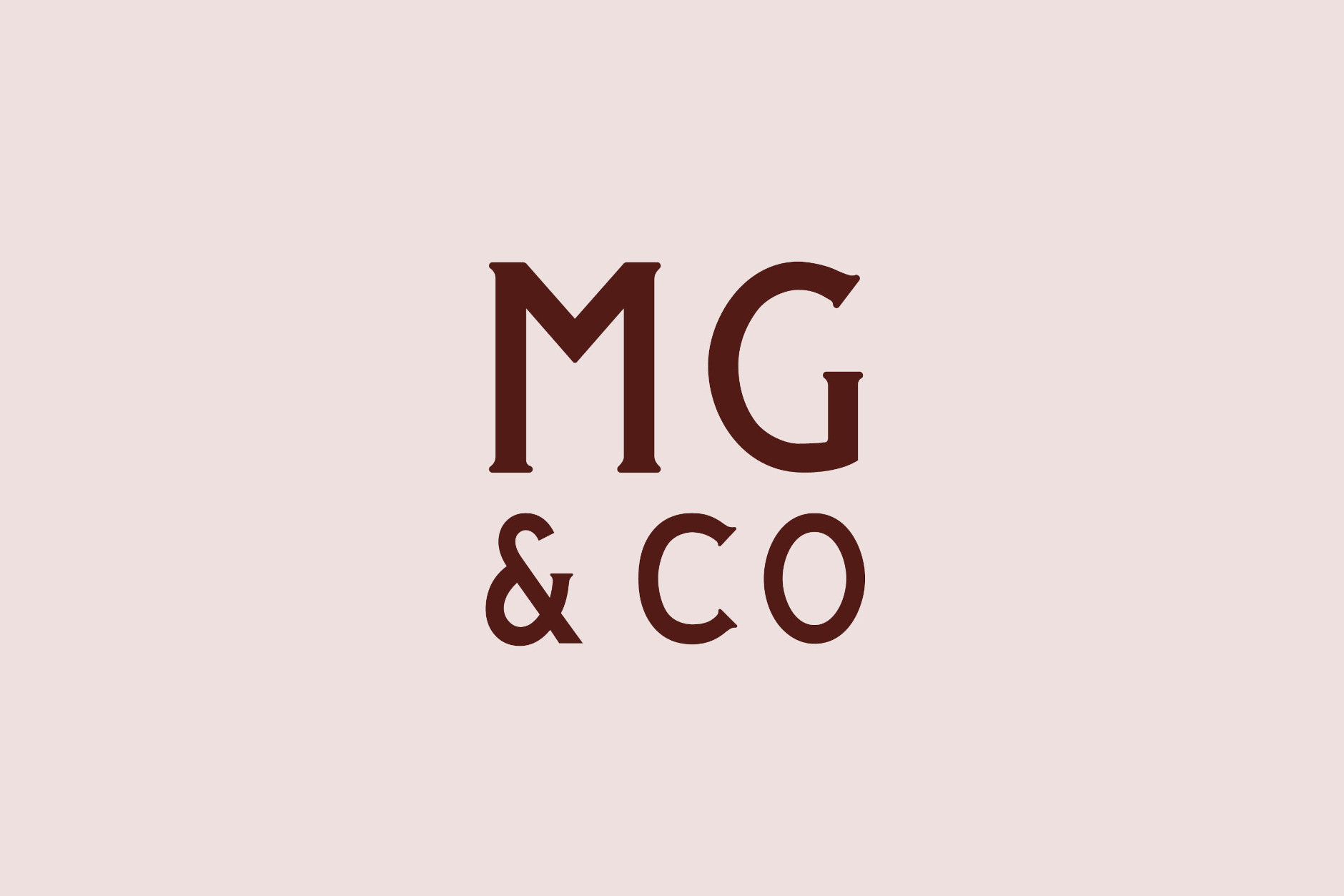
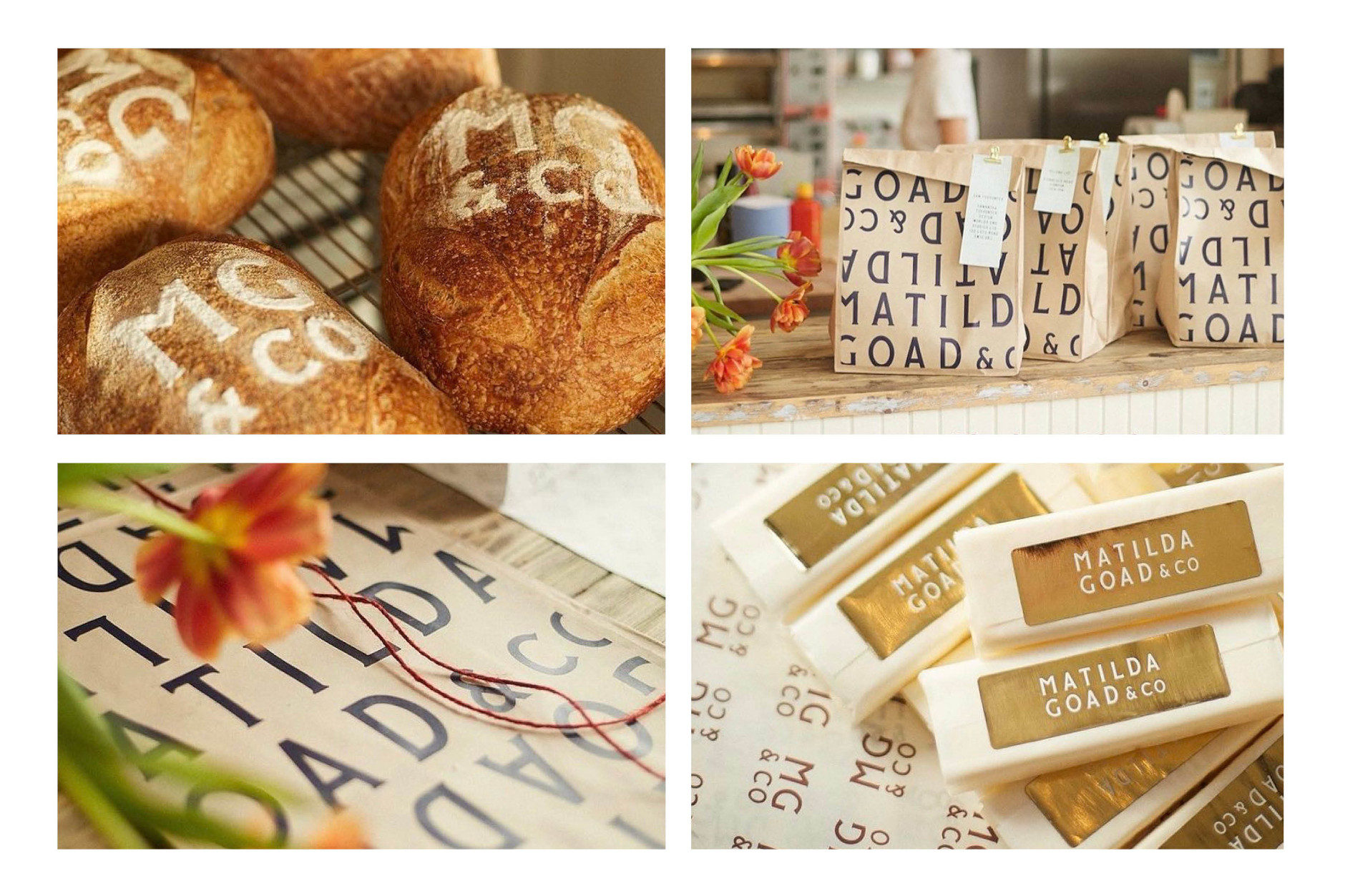
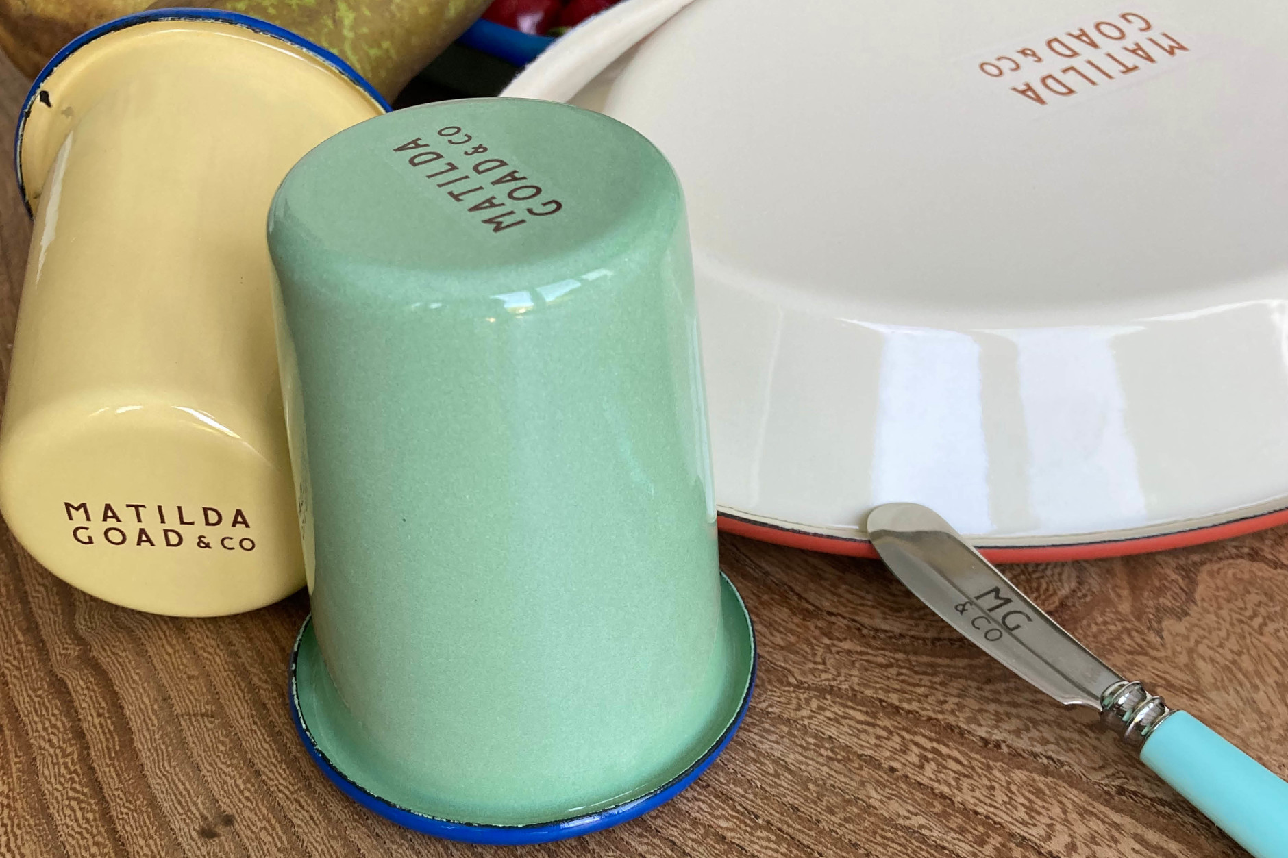
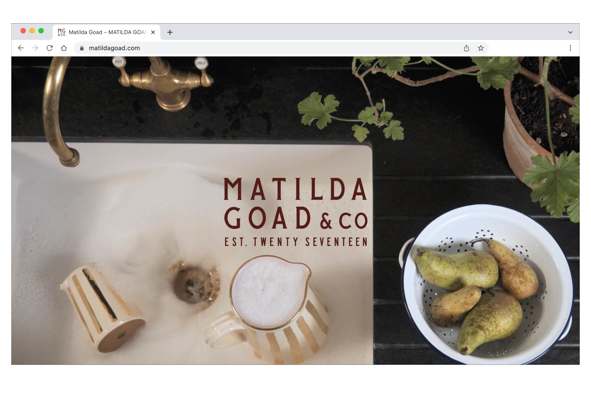
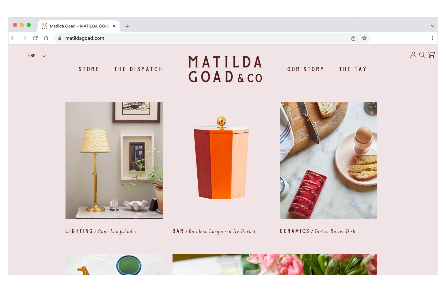
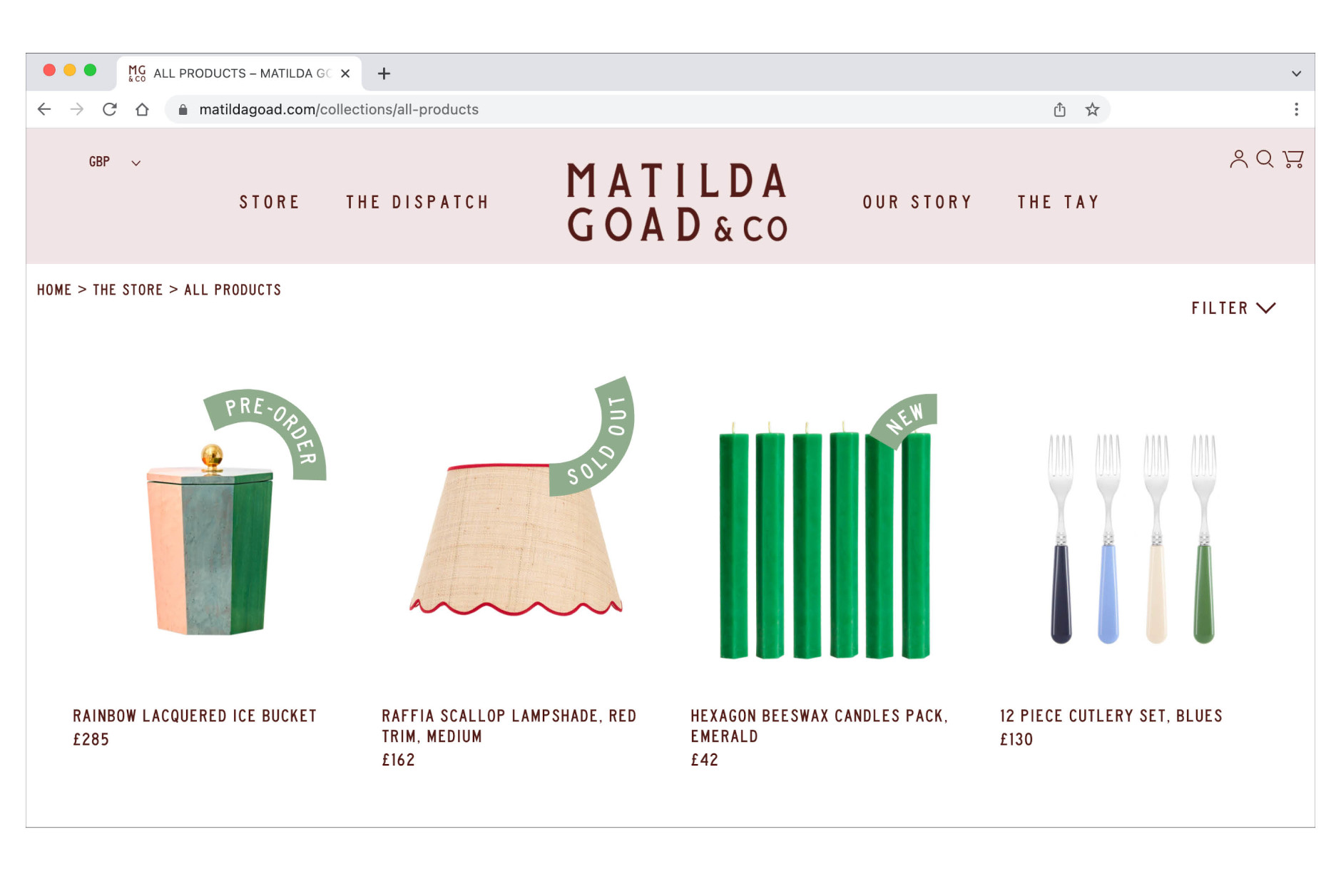
This rebrand was inspired by Matilda's approach to design; a contemporary take on the traditional English home. We created a bespoke typeface with soft serifs positioning the lettering as a block that has the feel of a stamp or a seal of approval. From the logotype, a monogram was developed that could be featured on her various products, whether the underside of a piece of ceramic or the end of a piece of cutlery. The warm typography features across the digital platforms, print and product and is intended to be as welcoming as a host inviting a visitor into their home.