Info
X

Barbican

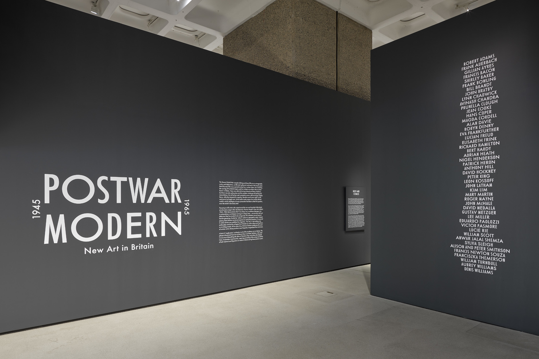
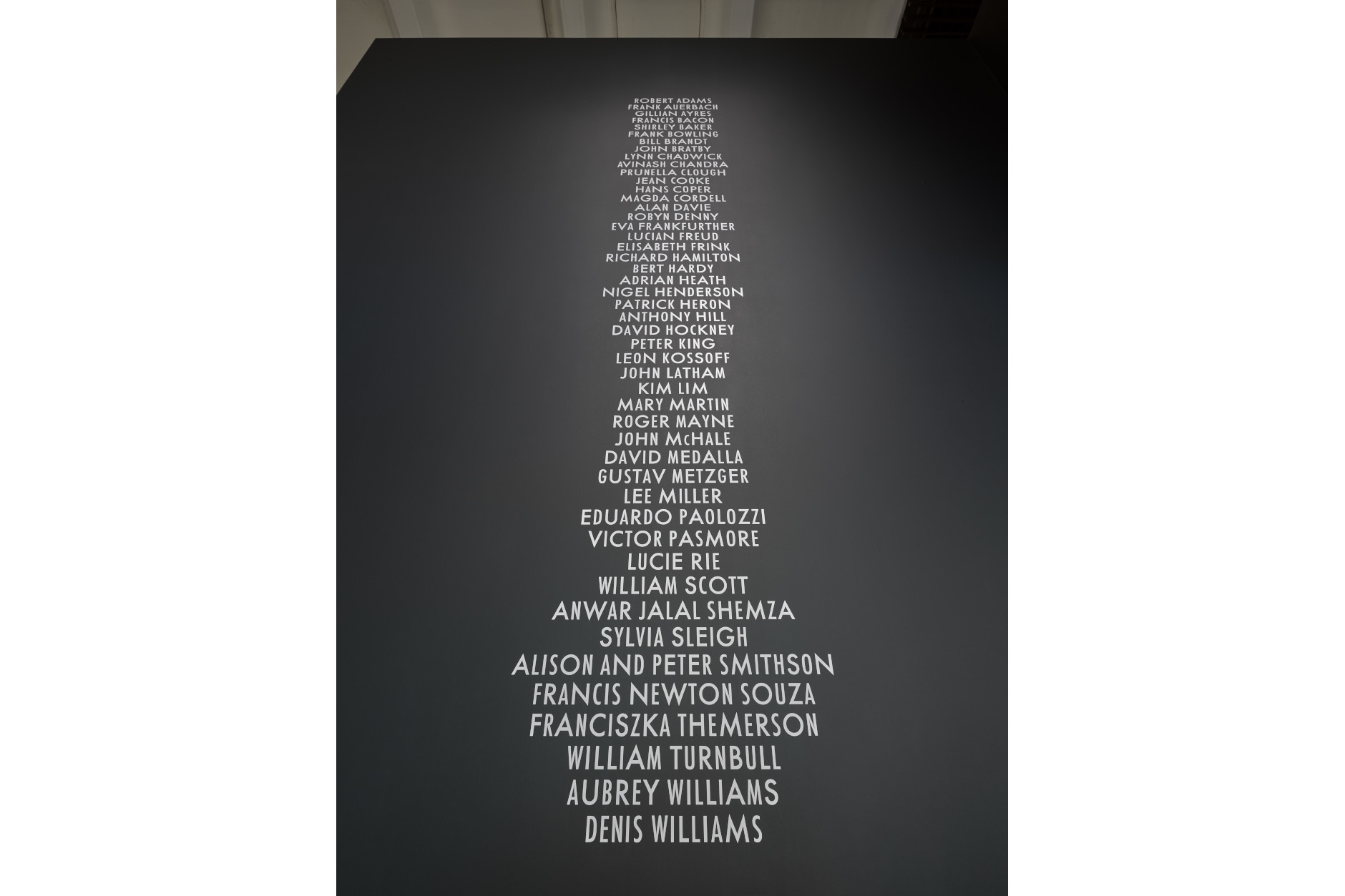
'Postwar Modern: New Art in Britain, 1945-1965'
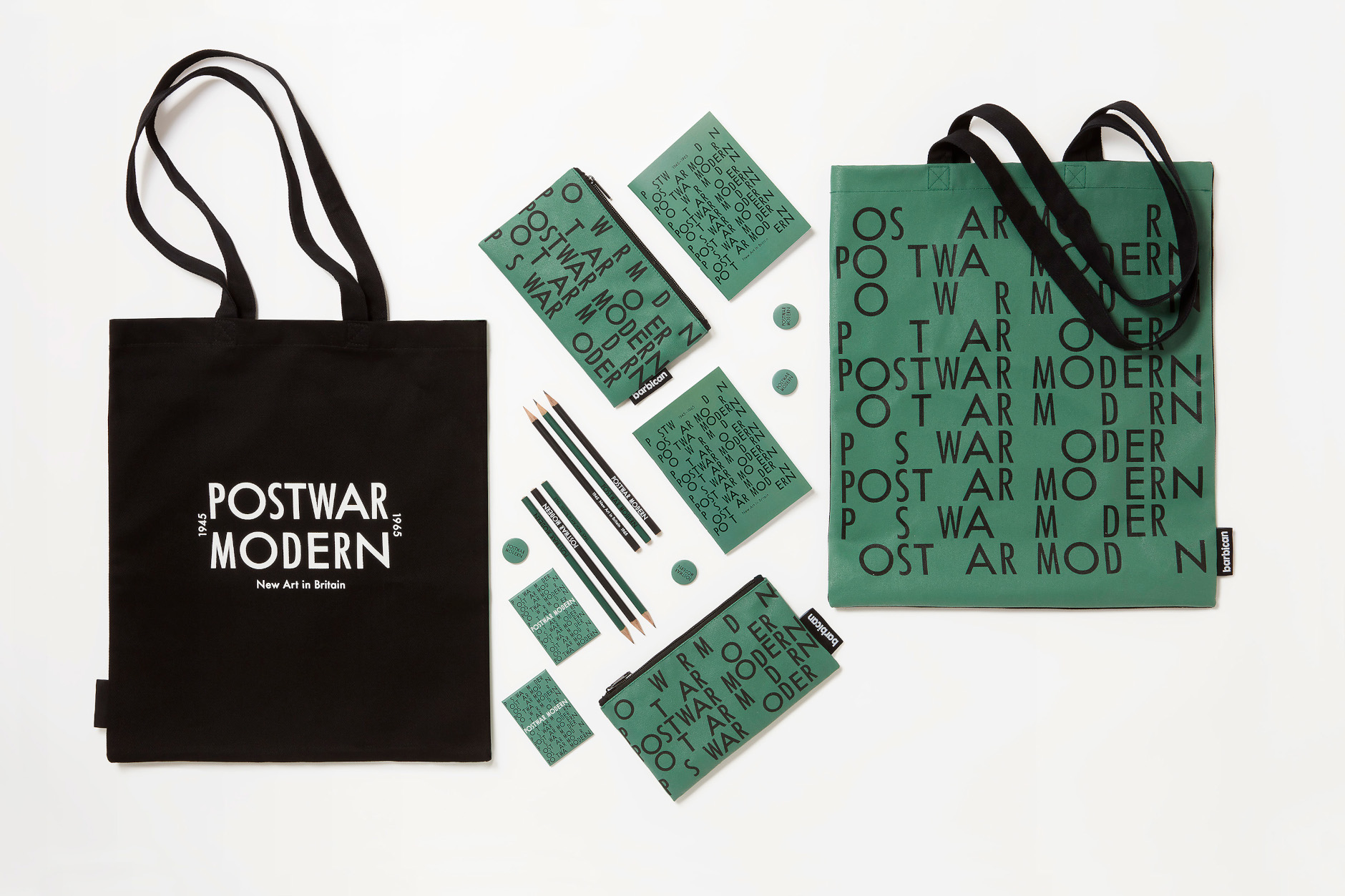
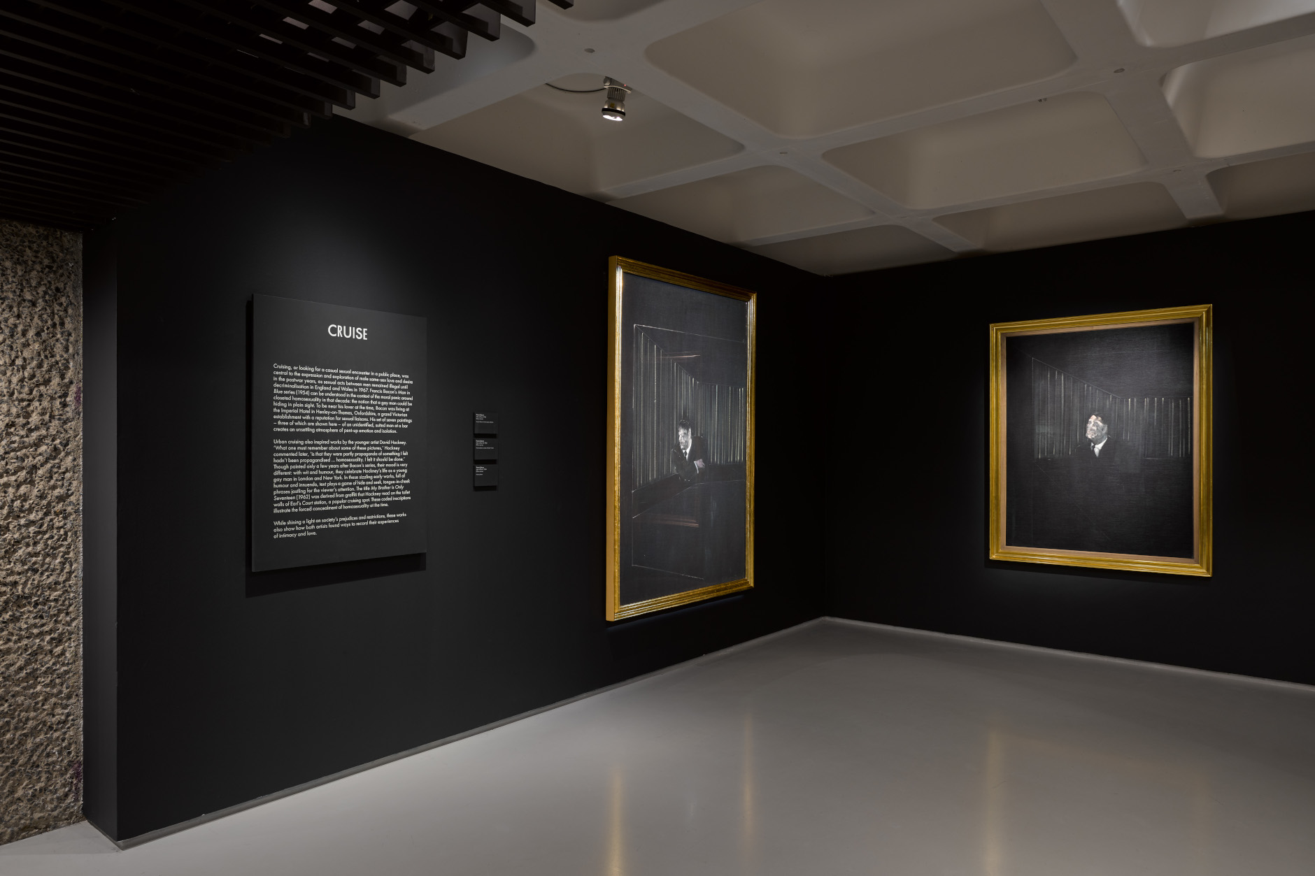
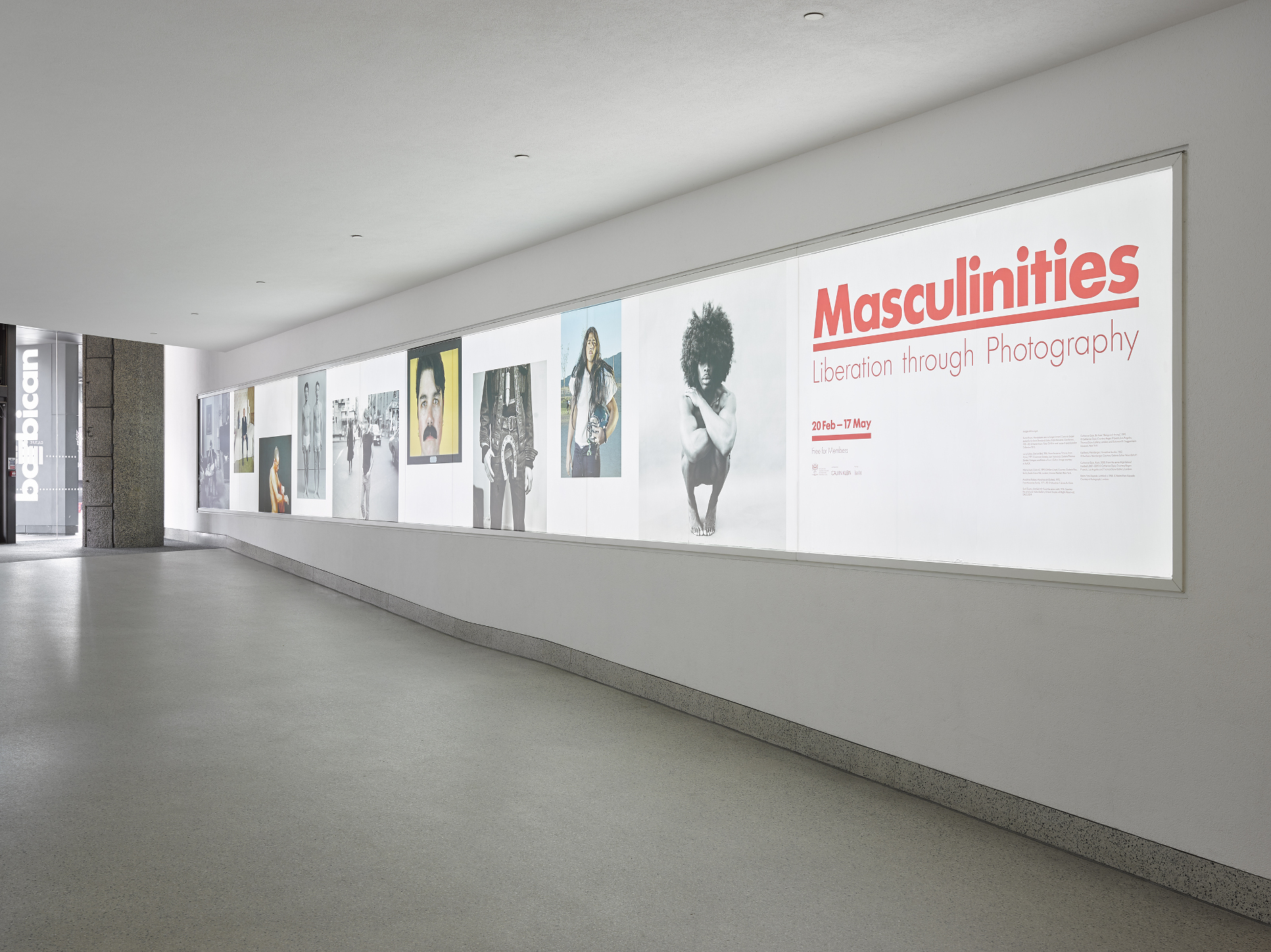
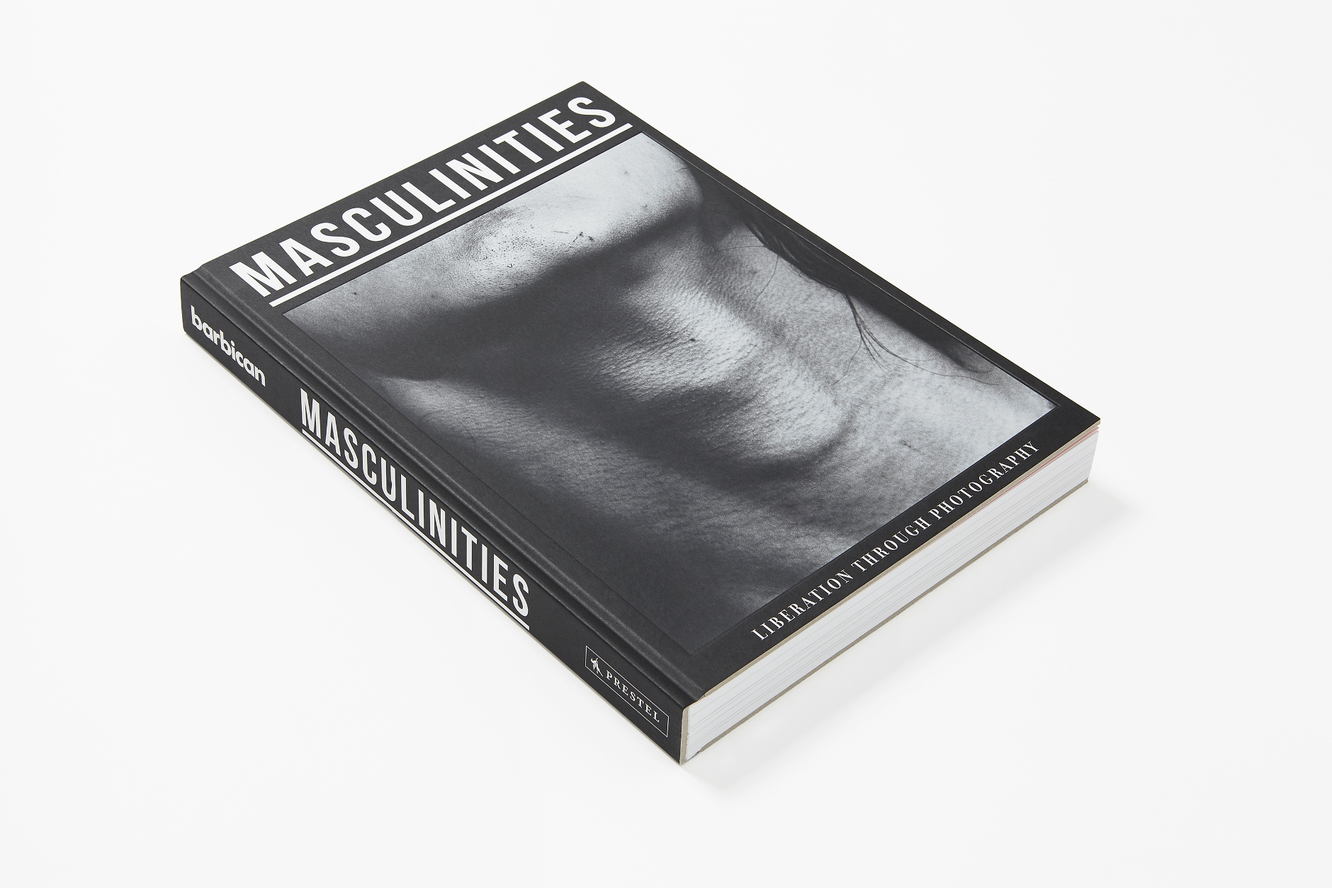
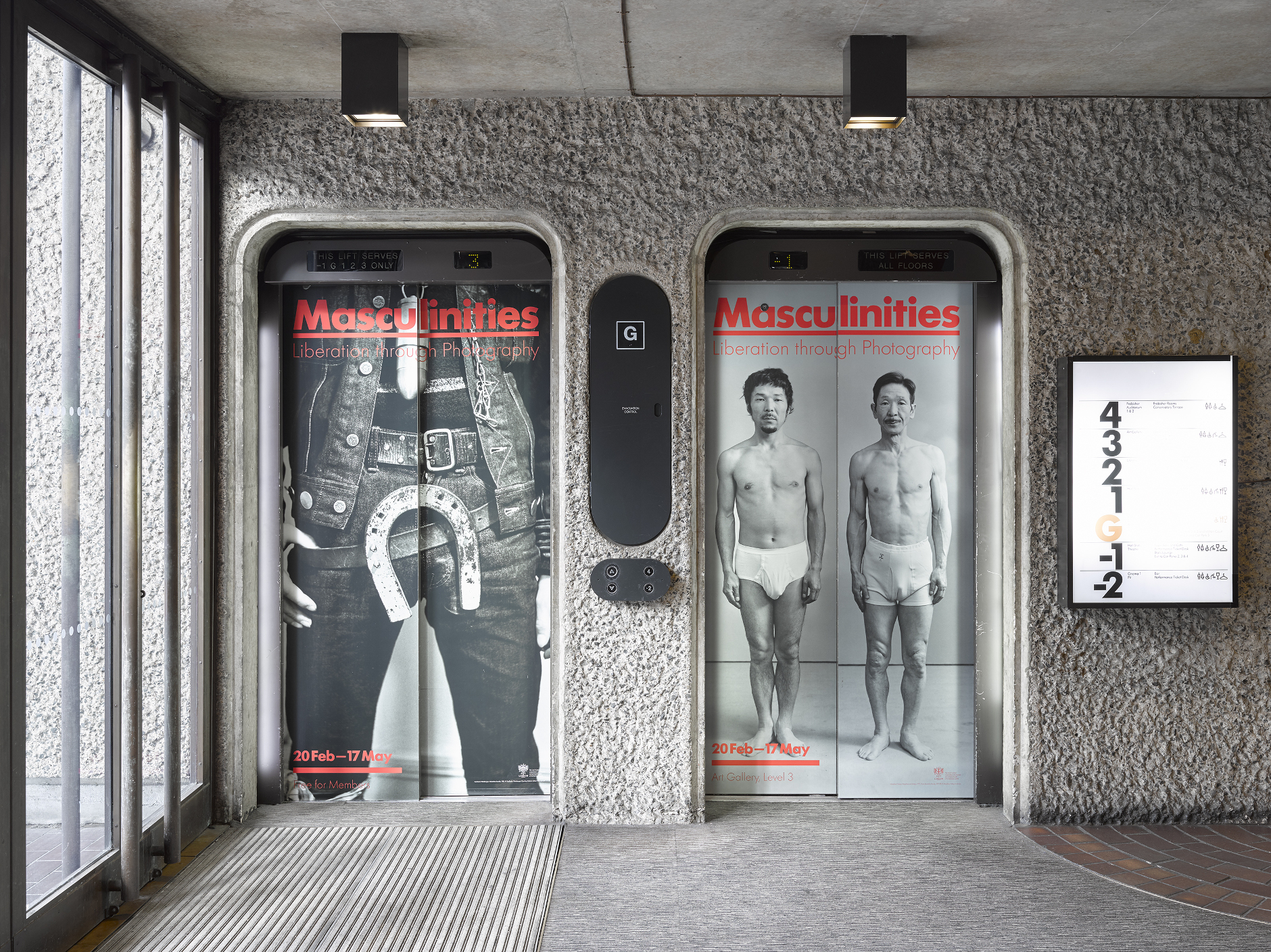
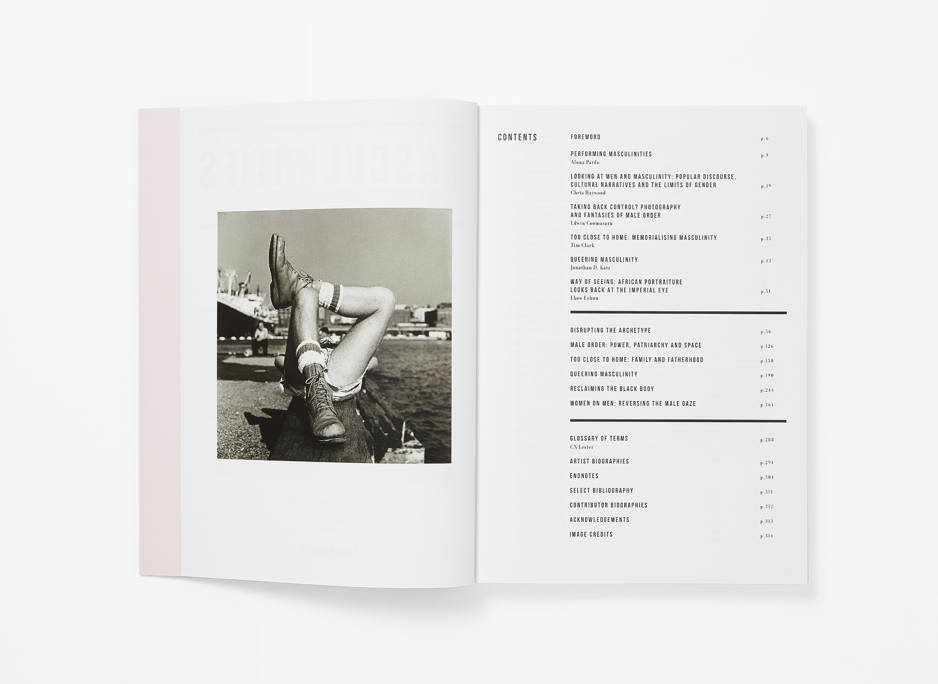
Exhibition Identity


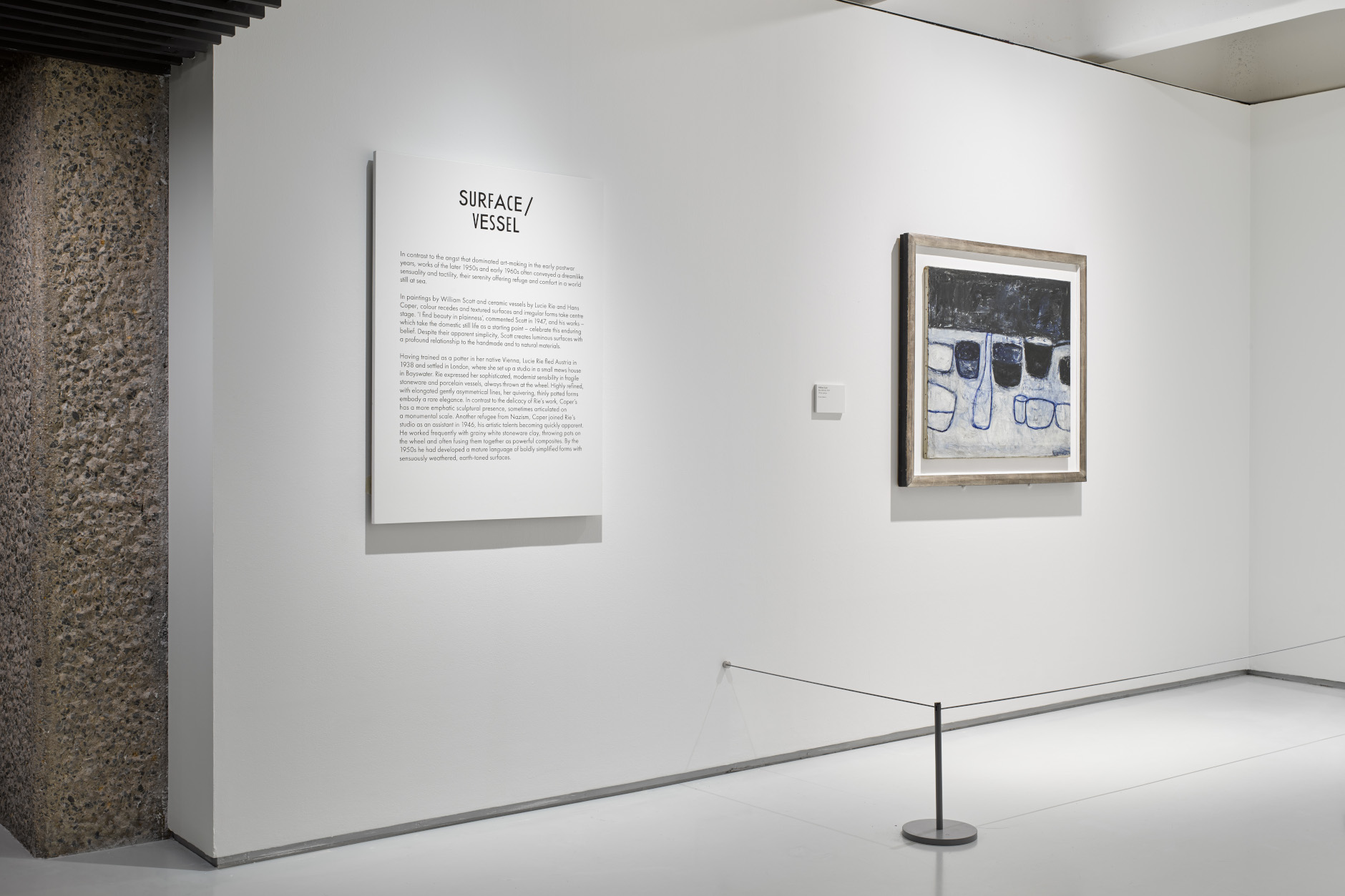
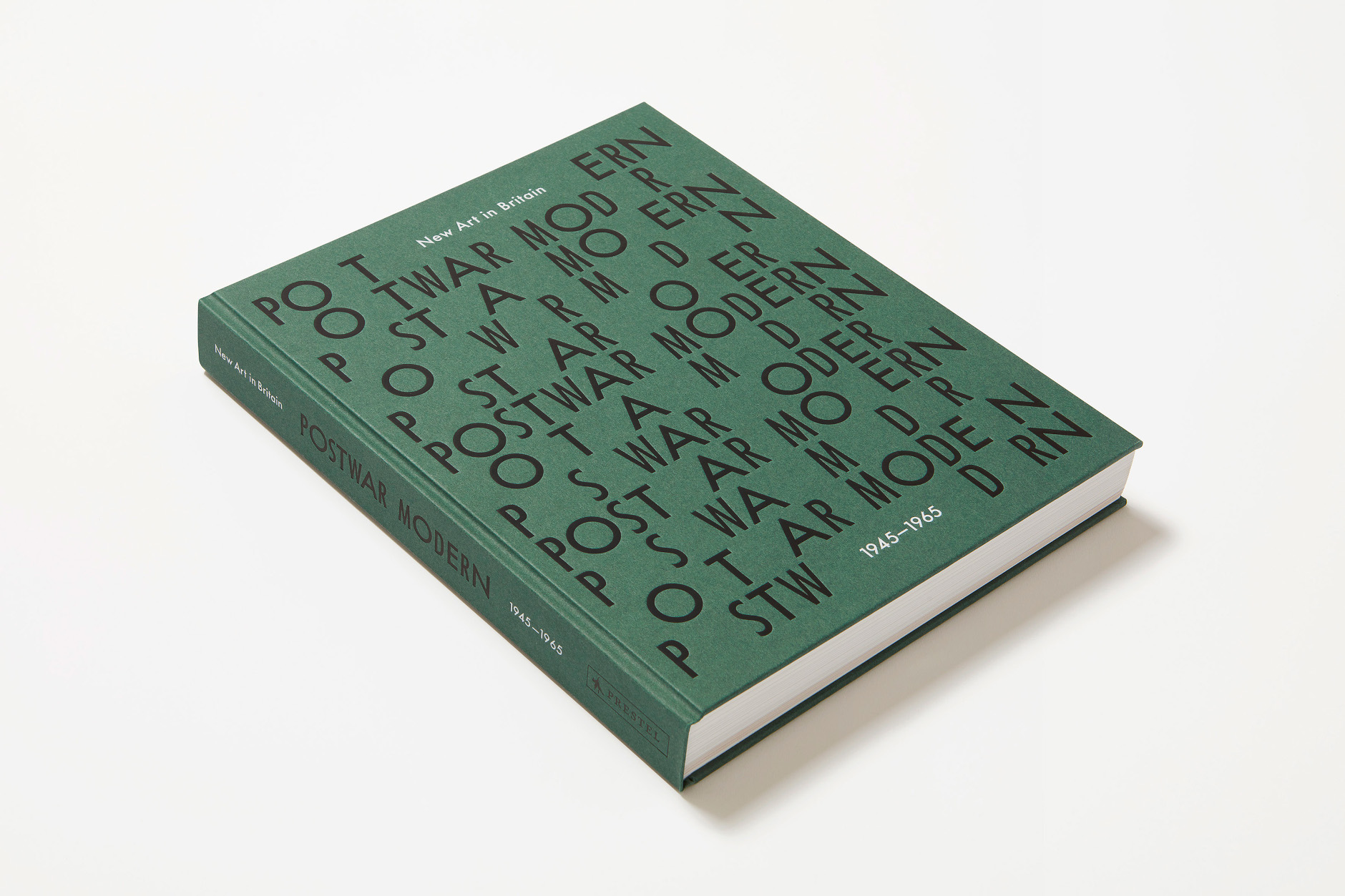
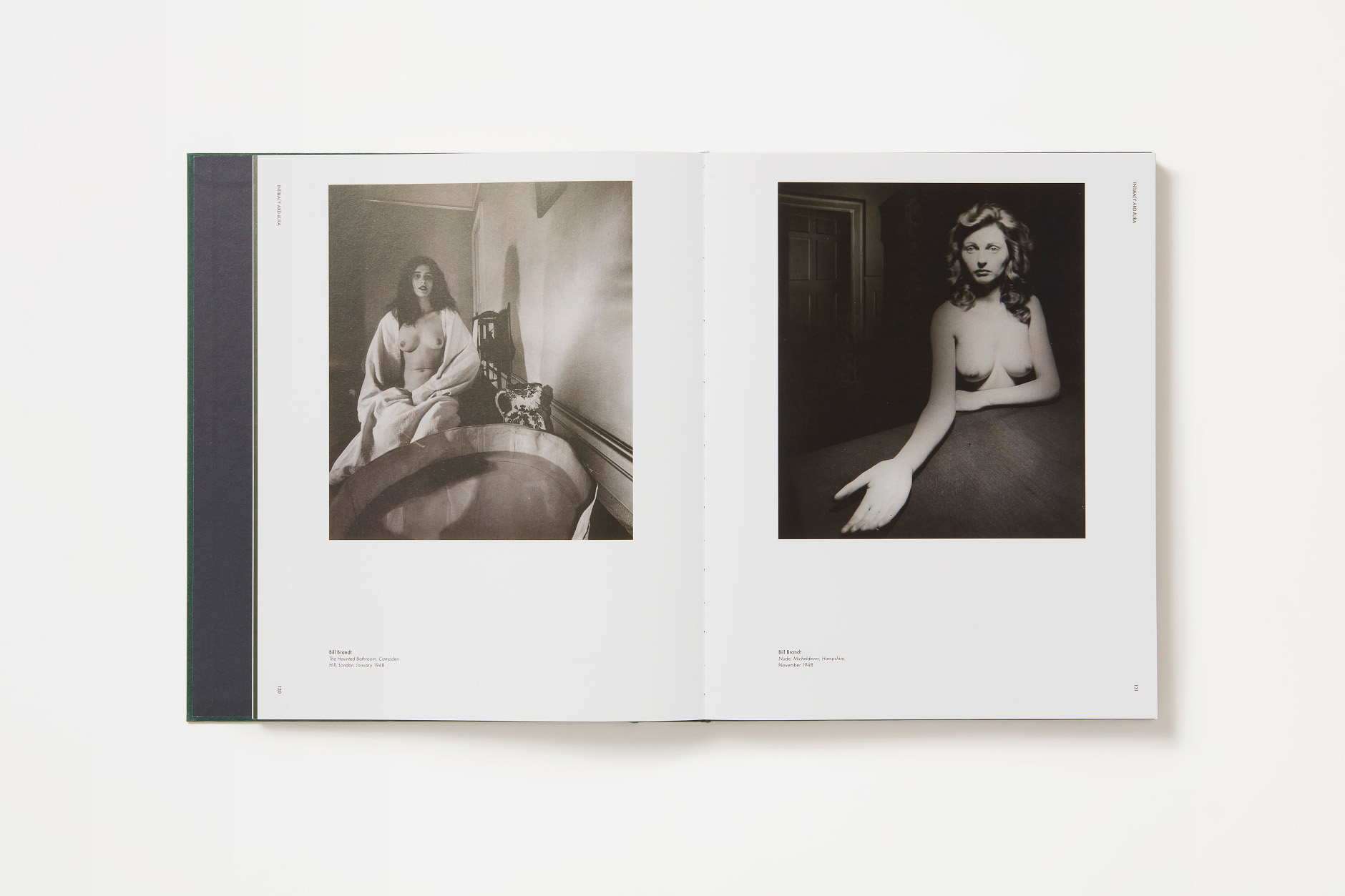
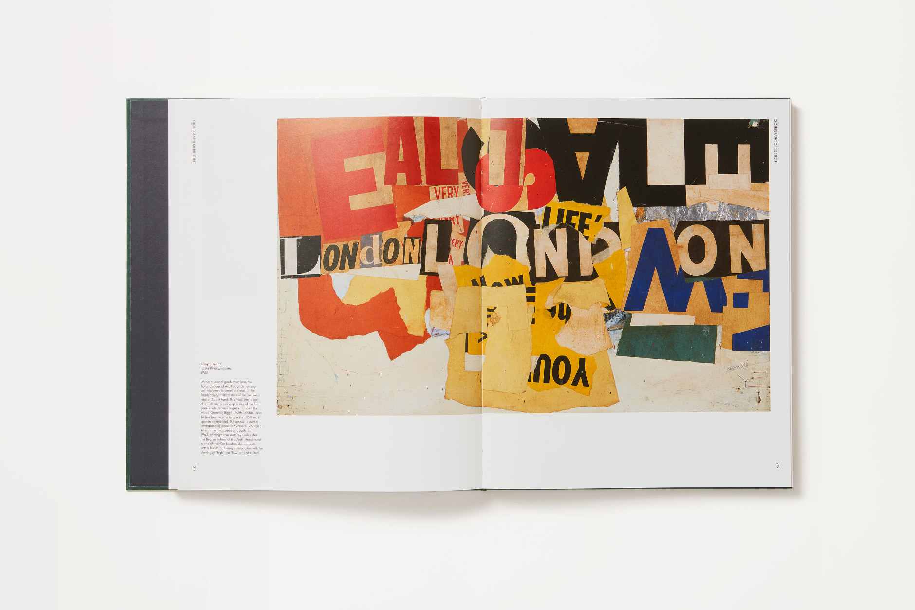
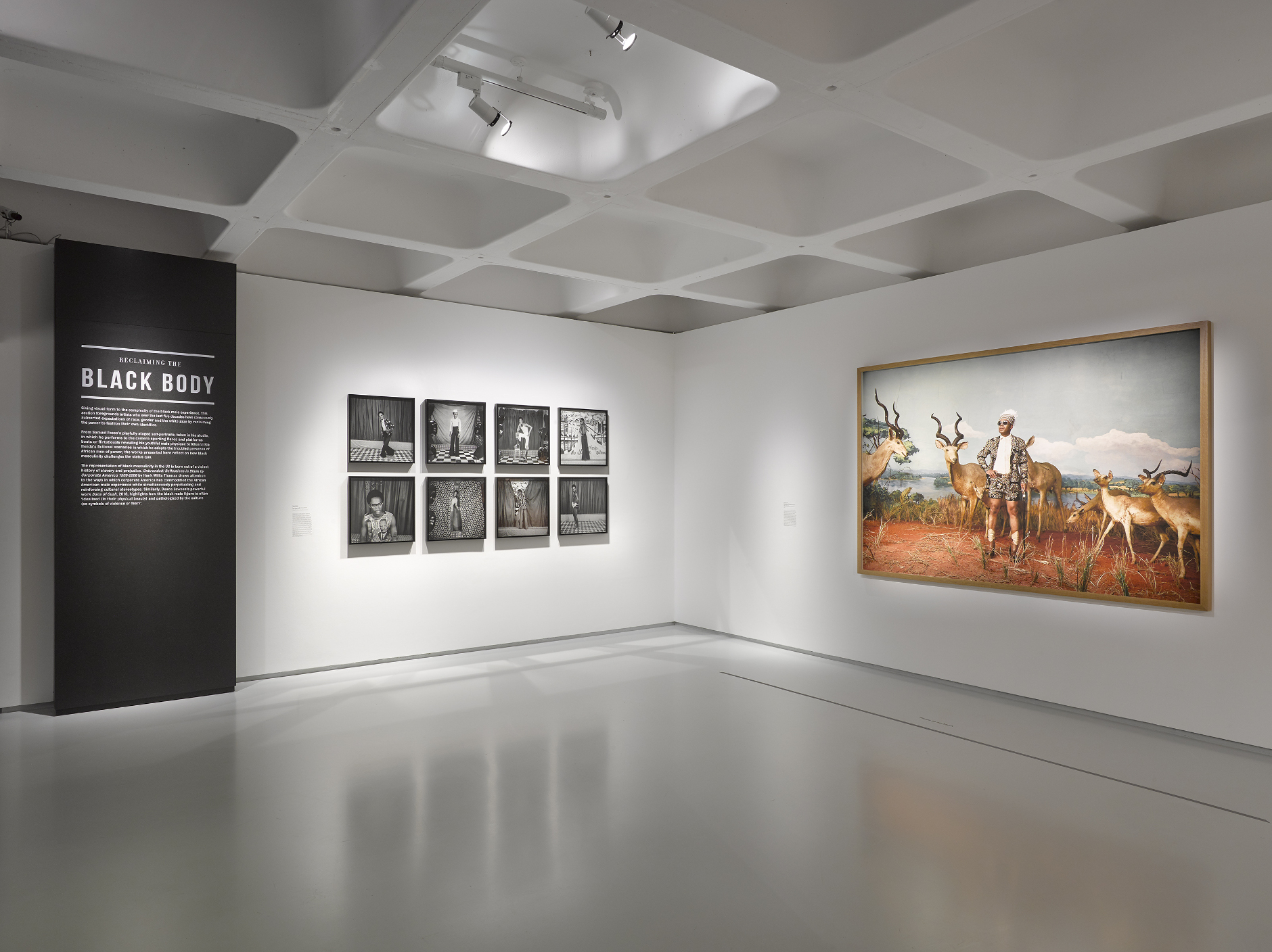
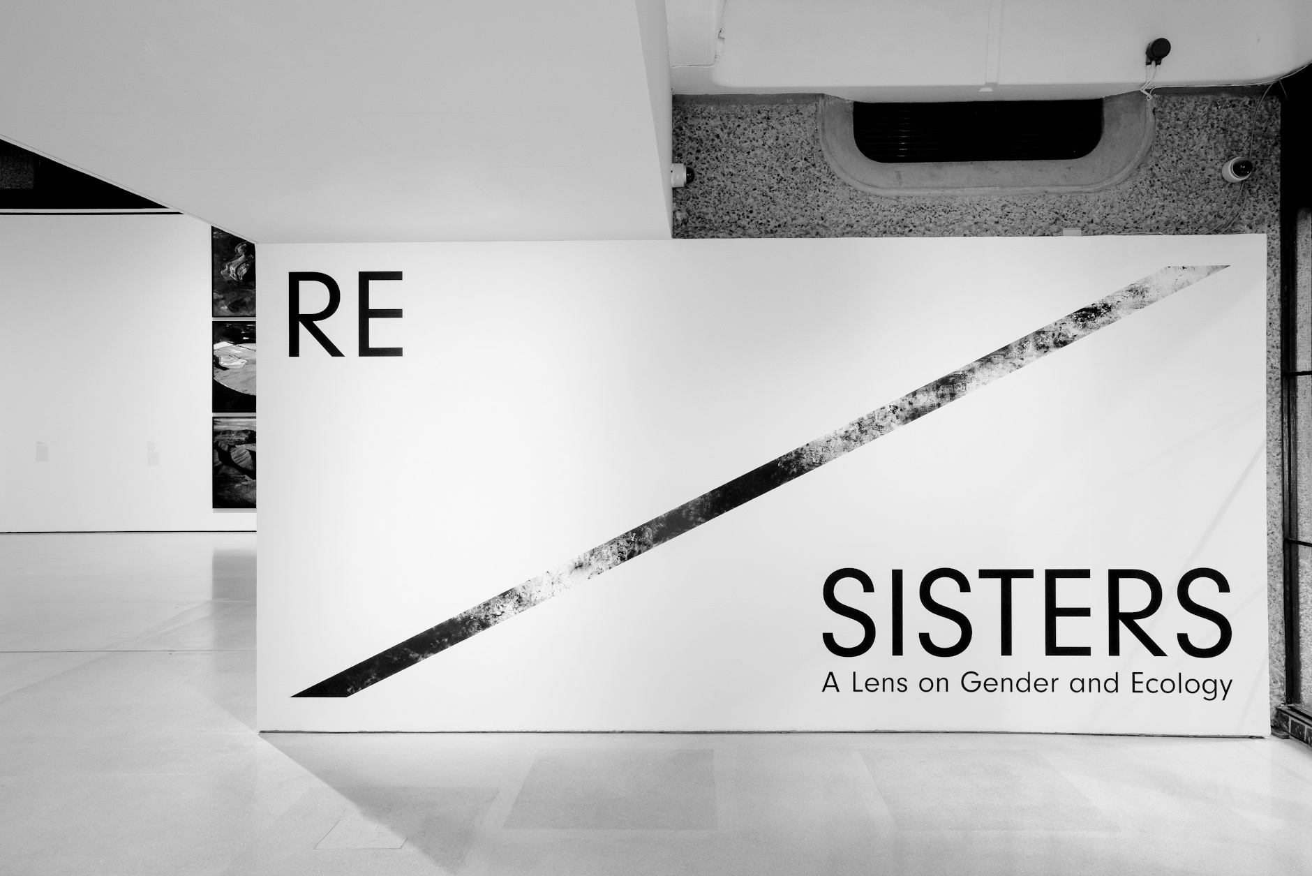
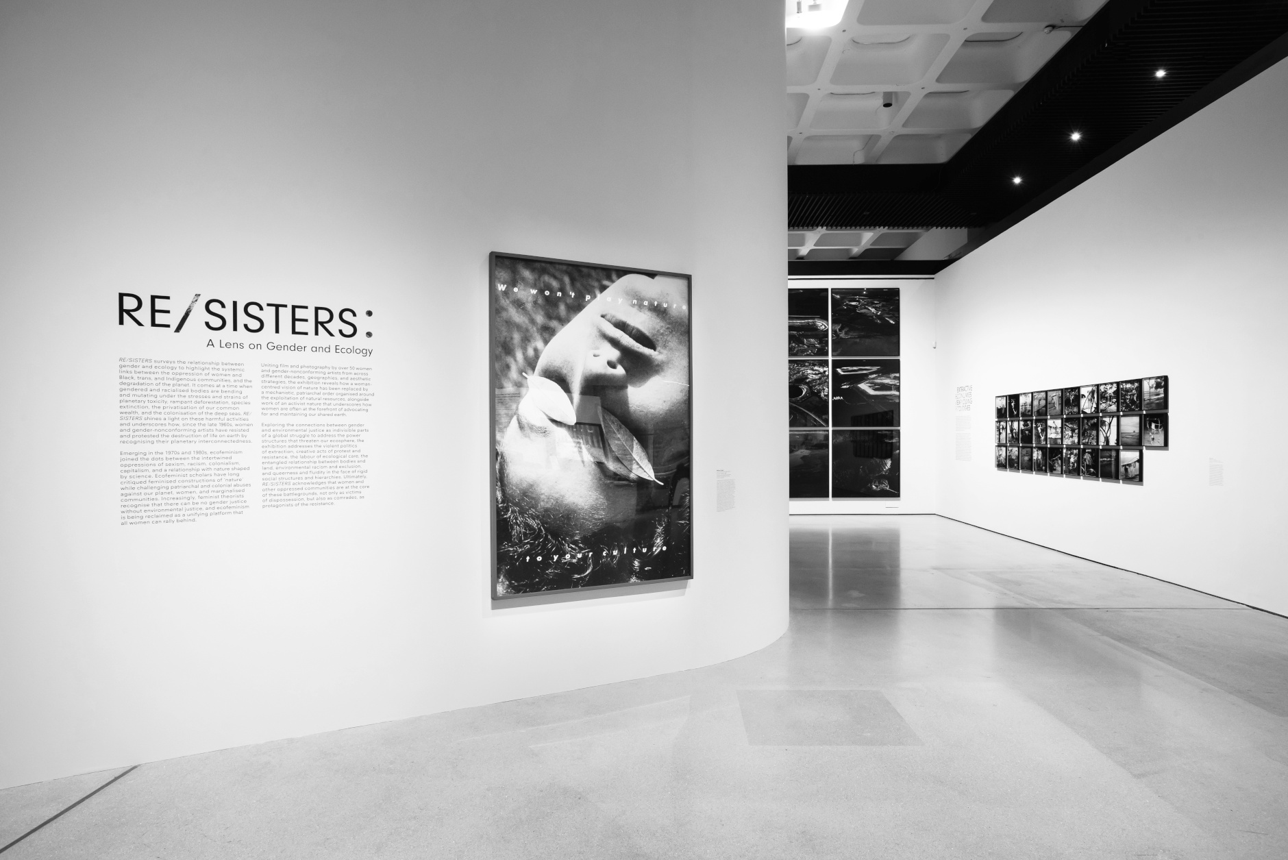
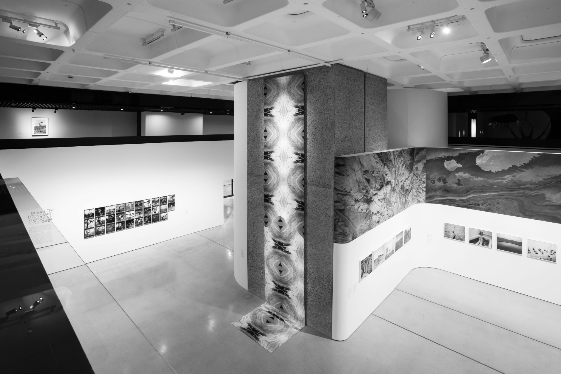
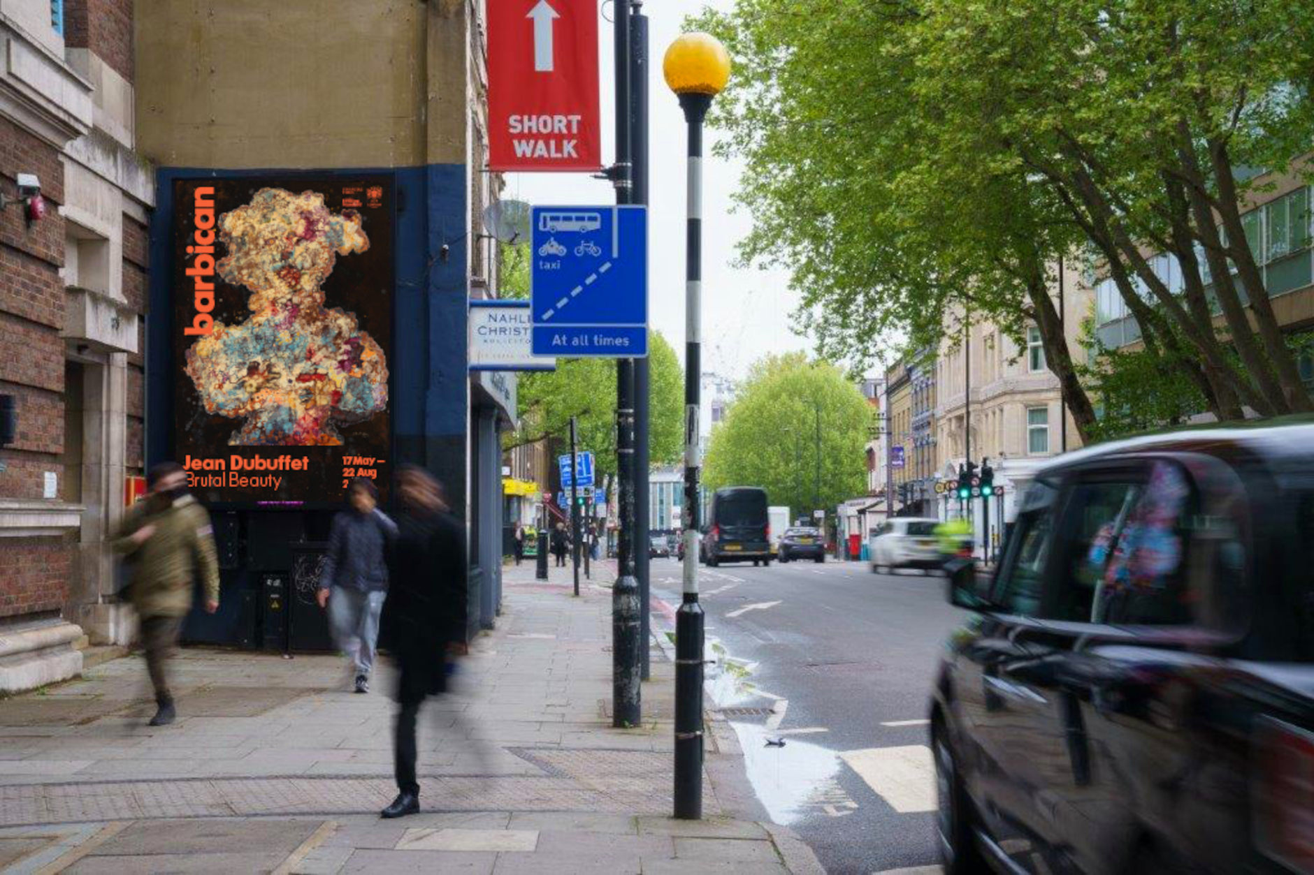
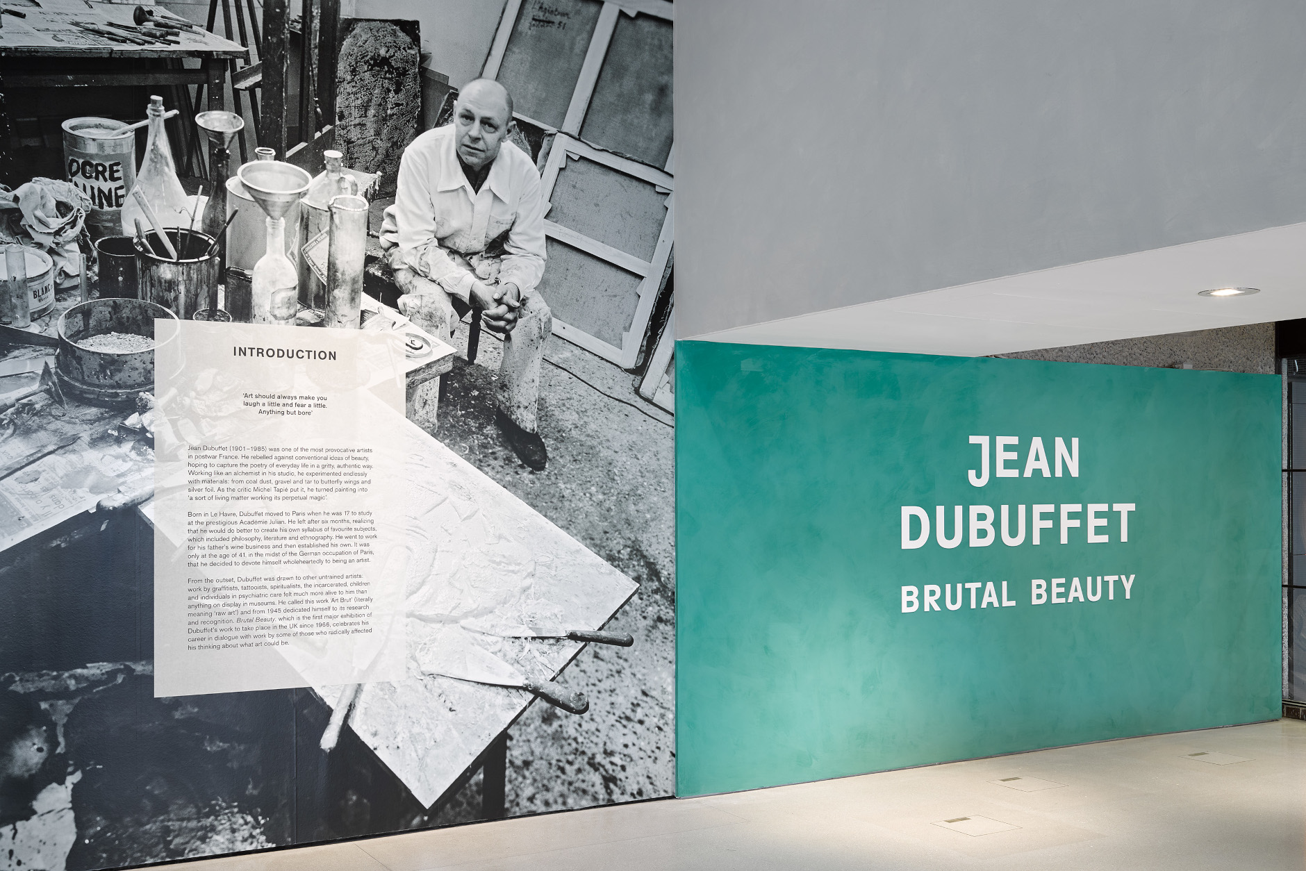
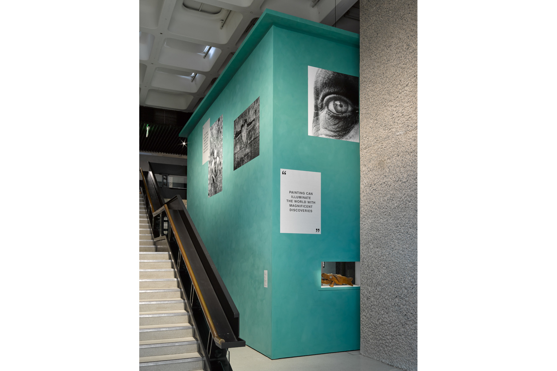
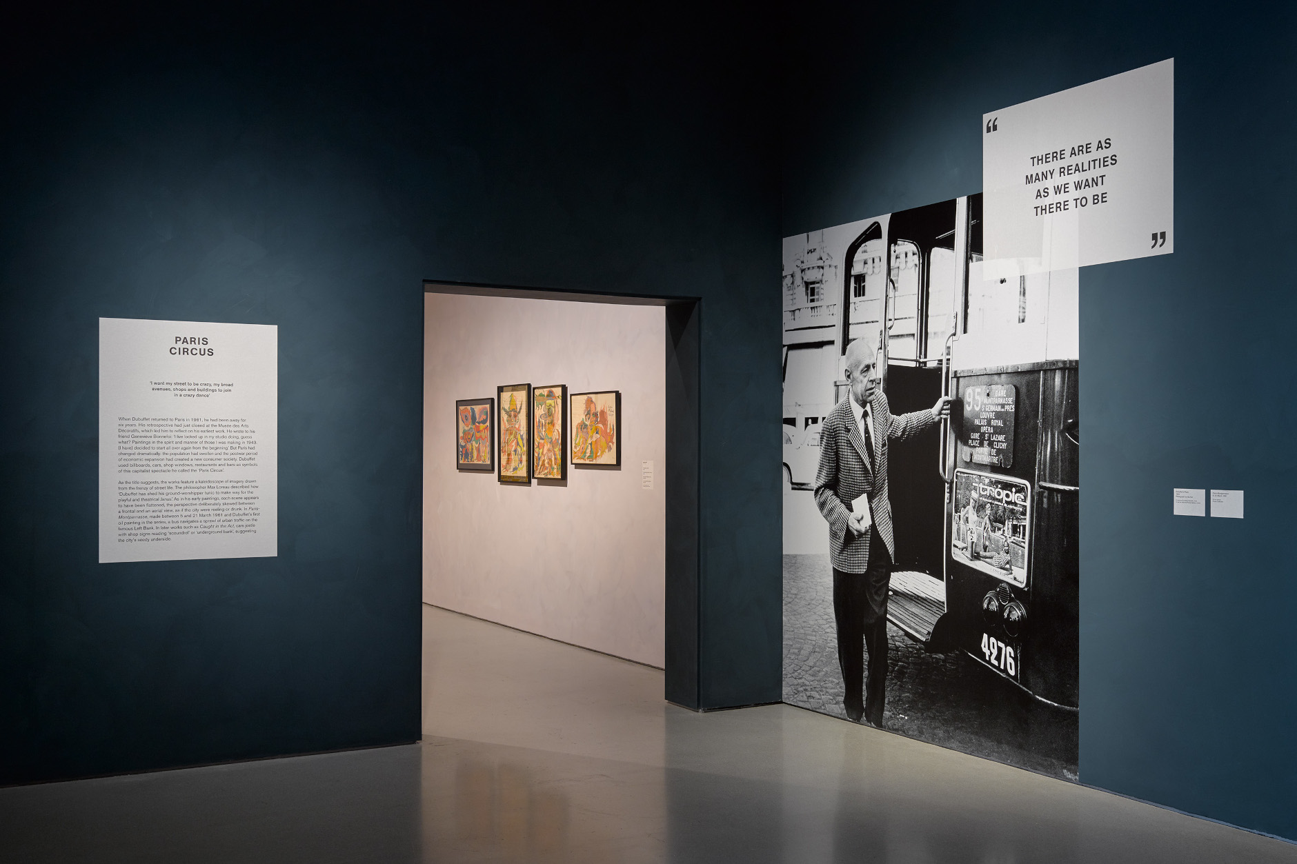
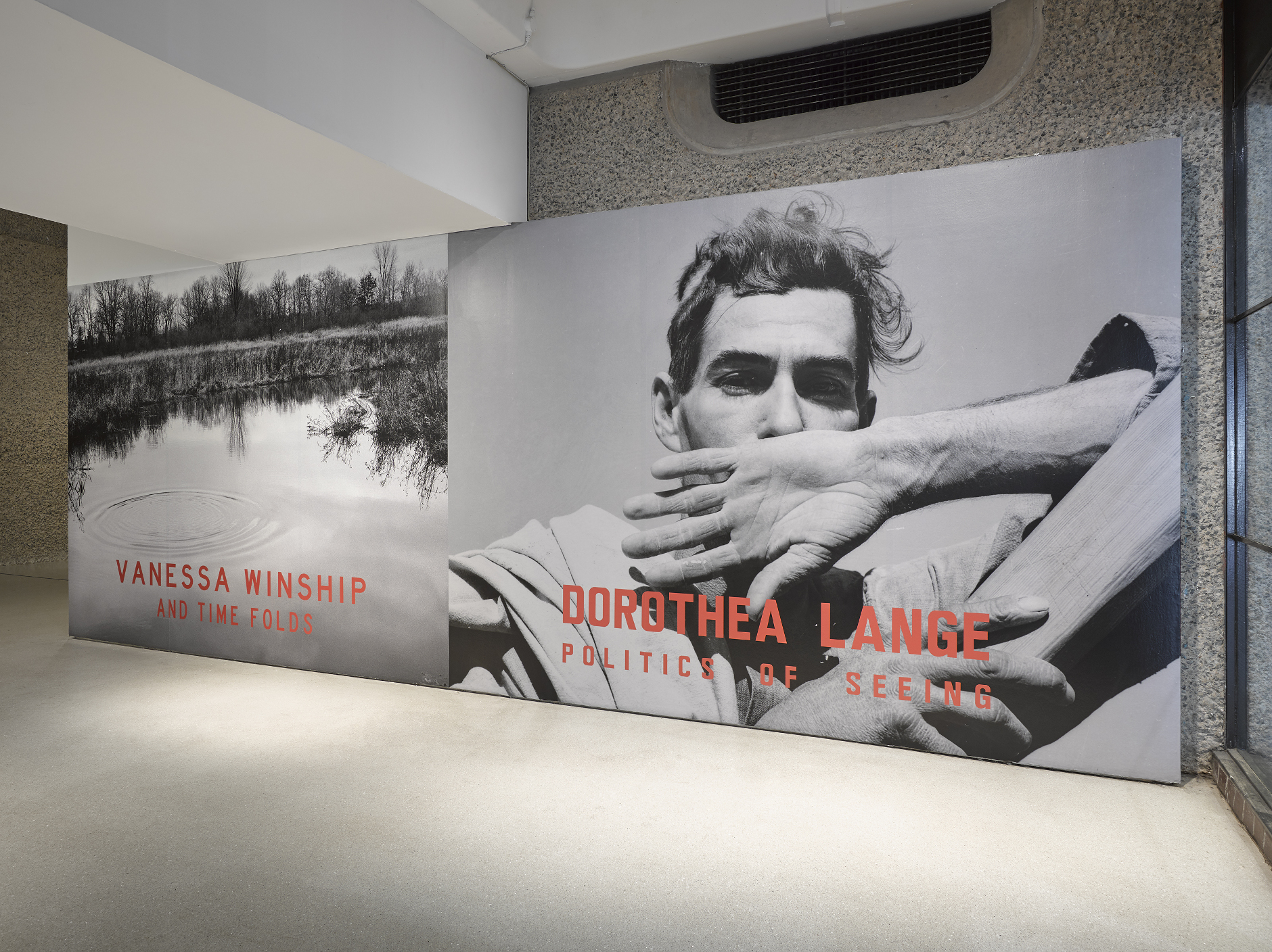
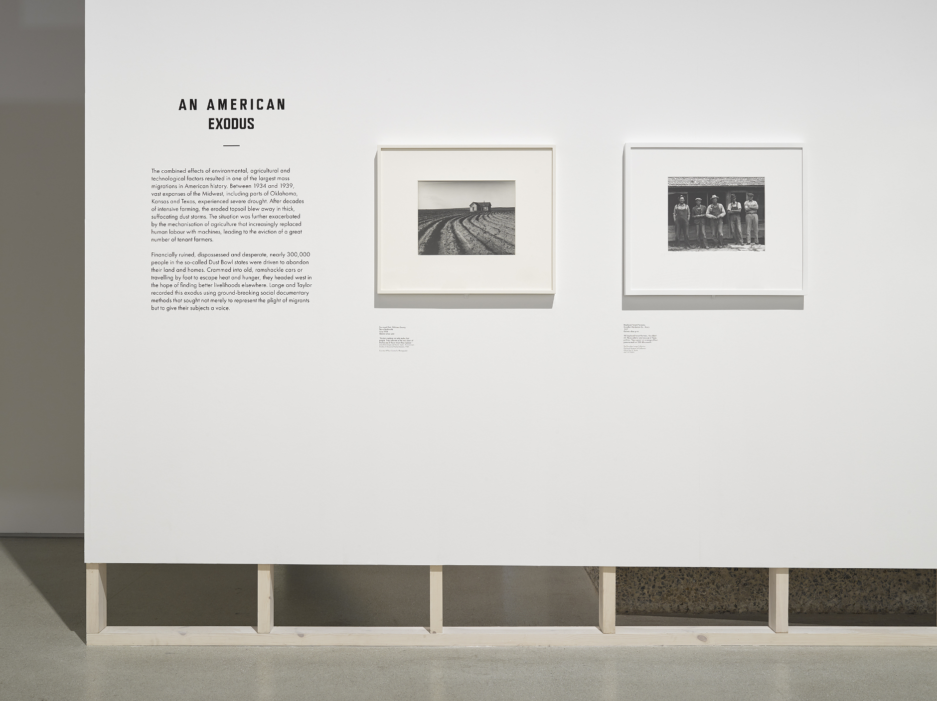
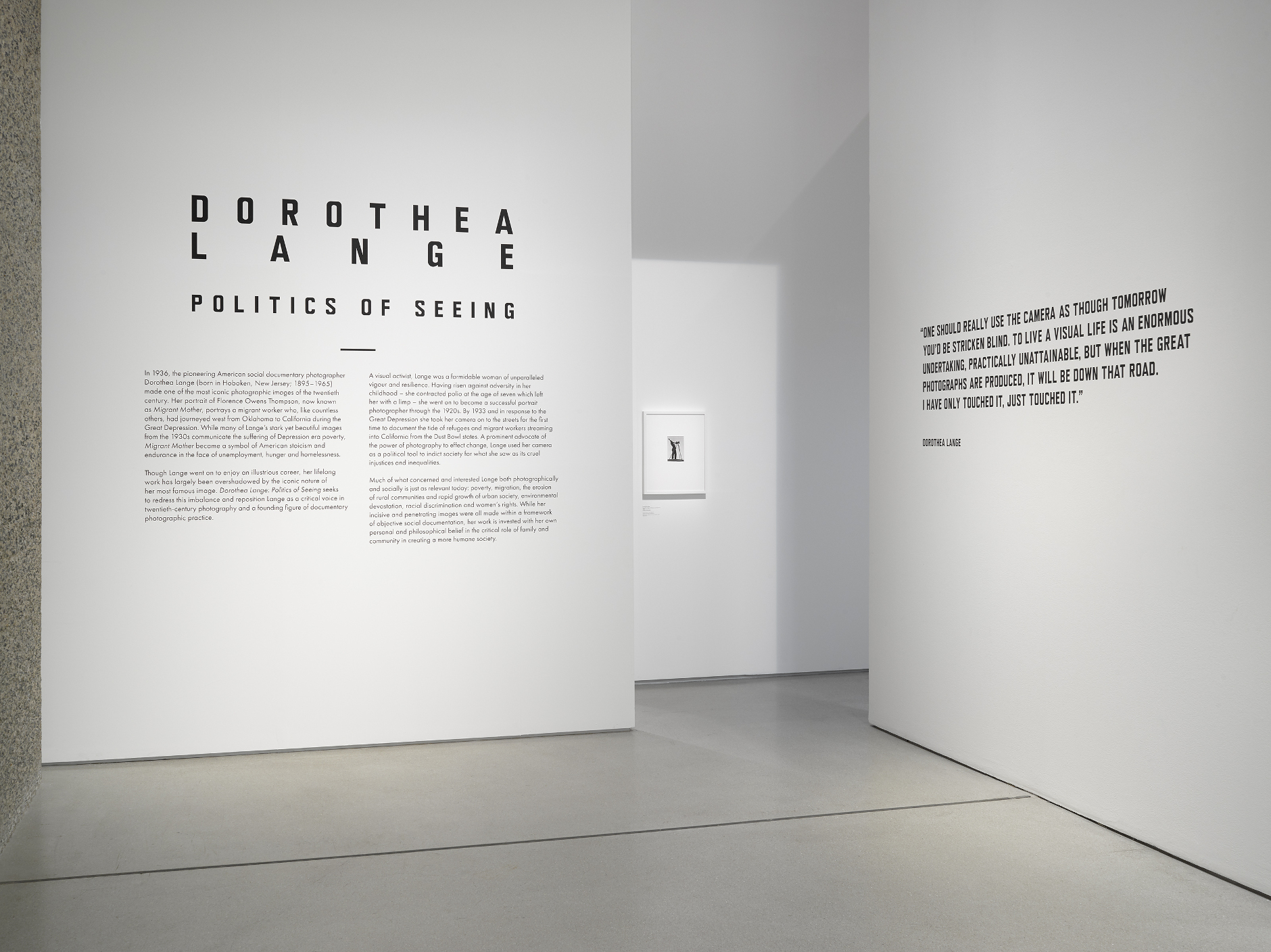
We were invited to create the exhibition identity, signage, catalogue and merchandise for this epic group show bringing together 48 renowned artists and 200 works produced in Britain after the Second World War. Inspired by the ‘concrete poetry’ produced in the same time period, we developed a bespoke typographic treatment to represent the exhibition identity.

Scroll down for more projects


Info
X

Barbican

'Masculinities: Liberation Through Photography'

Exhibition Identity


We were commissioned to create the marketing campaign, exhibition graphics and catalogue for this exhibition showcasing a diverse range of male perspectives. The stereotypical male is juxtaposed with unexpected aspects of maleness. For this reason we paired a bold, sans serif typeface and strong underline feature with a more delicate and typically 'feminine' secondary font. The bold linear qualities of the typography are reflected through the architecture of the exhibition.

Scroll down for more projects

Barbican

Info
X

Barbican

'Re/Sisters: A Lens on Gender and Ecology'

Exhibition Identity


A major group exhibition exploring the relationship between gender and ecology, highlighting the systemic links between the oppression of women and the degradation of the planet. Inspired by geological textures and hatchings, The Bon Ton experimented with mono-printing and hand-painted textures within the typographic elements. This tactile application featured across the exhibition graphics and book design to bring a softness that conveys the human touch.

Scroll down for more projects


Info
X

Barbican

'Jean Dubuffet: Brutal Beauty'

Exhibition Identity


An exhibition celebrating French artist Jean Dubuffet (1901-1985), one of the most singular and provocative voices in postwar modern art. We were invited to create the exhibition identity, signage, catalogue and marketing campaign. The title ‘Brutal Beauty’ describes the strong contrasts within his work and so we used a mixture of very light and very heavy sans serif to illustrate this. We were drawn to grotesque typefaces in particular as they have a slightly crude appearance and a lot of visual character. Texture, layering and use of paper were important to convey the tactility of his work.

Scroll down for more projects


Info
X

Barbican

'AI: More Than Human'

Exhibition Catalogue


We used artificial intelligence in the design of the catalogue itself by developing a generative font for the primary typeface. This randomly generated font features throughout the book to add an element of experimentation and play. The book was divided into four colour sections to help organise the information and make it more accessible to the reader. Due to the diversity of images we used duotone printing techniques to help unify them. Digi Grotesk - Art Direction: The Bon Ton / Design: Aldo Caprini, Flavia Lunardi and Carlos Romo-Melgar.

Scroll down for more projects


Info
X

Barbican

'Dorothea Lange: Politics of Seeing'

Exhibition Identity


For this exhibition and catalogue we researched the landscape of California during the Depression and graphics used by the Farm Security Administration. This resulted in the all-caps, sans serif typography with varied spacing that occurs in hand-rendered signage from the time period. We were influenced by early issues of Aperture magazine that use a diverse grid for imagery.